*We covered quite a bit in class - good work everyone! REMINDER - You will need to buy the FULL COLOR RANGE of ACRYLICS for class next week (we're painting in class).
IN CLASS: TEXTURE
* Texture Discussion (Implied, Invented, Actual, Pattern/Texture Relationship)
* Illustrator: New Tools, Texture
* Homework
HOMEWORK:
*Finish Boxes
*Buy All Paint (full color range of acrylics)
Boxes
Materials: Illustrator, bristol, high quality photo paper (matte/gloss/semi), glue, sketchbook...
Overview: You are continuing to work with organic and geometric, positive and negative relationships as you incorporate implied and invented texture into your compositions. Similar to your shape elaborations, you will begin with basic pictorial elements and elaborate your figure/ground relationships utilizing tools and methods for creating texture and volume.
Three Elements/Steps of the BOXES assignment (separate layers in Illustrator will help you organize):
1) Background
Color: Grey Scale Only
Linear (Stroke Only)
Pattern (Invented Texture)
Geometric
2) Middleground Color: Analogous Color
Solid Objects (Volume)
Strategic Placement of Textures (Invented or Implied)
Geometric
3) Foreground Color: Complementary Color (Spot Color In Relation To Analogous Color Choices)
Solid Objects (Volume)
Strategic Placement of Textures (Invented or Implied)
Organic
The final step (the wrench in the program) is to include an image that you will LIVE TRACE and include in your composition. Some of you may have already used LIVE TRACE in an earlier layer...if not, add that image now. Remember you can do what you wish with the image (repeat, transform, etc.).
Basically, you have:
BACKGROUND (arrangement of varied geometric forms in grey scale),
BOXES ("geometric structure layer", think of architecture as an analogy. Introduction of solid objects in restrained analogous color),
ORGANIC SHAPES (unique objects/shapes with volume and mass, strategic placement of texture/pattern, organic objects/shapes will exist around and in your boxes - organic/geometric etc.).
The final step is to weave together your composition to create a coherent and unified whole AND add a live traced image (or images) - as discussed in class.
**Get your sketchbook out - you will be finding analogies in your everyday to help guide your compositions!
FIRST!!! Make sure you conceptually can wrap your head around what is required (distinct layers that you will weave together). For each layer I would like you to do a little research. For example: The geometric layer can be thought of as an architectural mapping, a city planning complete with buildings and or houses. Go online and or the library and start a thread of research...(architects in general, in chicago, maybe specific styles, etc.) - start with simple searches and get more specific as you go. Think of TEXTURE, ORG./GEO. relationships, etc...put this research into your sketchbook. Do the same for each layer. This very informal and brief amount of research will help guide you in your decision making process.
1. Sketchbook to Illustrator (Grey Scale Geometric Layer):
We are starting with a simple geometric shape: the rectangle. In your sketchbook, arrange linear geometric forms of different sizes, values, and opacities (but same stroke size) to create an invented/visual texture. As you are deciding how to construct your geometric layer, keep in mind our discussion of shape relationships (edges, one to another, pos./neg. space, in relation to frame), as well as the principles of balance (weight), emphasis/dominance, and rhythm. Keep these sketches loose, quick - you will be moving these ideas into Illustrator. I'm looking for GEOMETRIC, LINEAR shapes - start with rectangles if you desire, and if you feel like a challenge: push the rectangles towards some more unique geometric objects (architecture? etc.).
Key Concepts:
*Overlapping/Opacity?
*Spacing?
*Compositional Weight/balance?
*Value shifts?
*Proximity, Location, Orientation, Scale?
You will find a surprising amount of depth can be found be simply overlapping and arranging linear geometric forms of varying values and opacities.
NOW MOVE YOUR SKETCHES TO ILLUSTRATOR - LAYER ONE! (if you haven't done so already)
Using the rectangle shape tool AND predominantly the pen tool you can quickly and efficiently place your geometric forms around your work space. Use grey scale only! Push and pull (distort/transform/relocate) your rectangles until you have created a successful and balanced background. Then continue to the next step. Remember to SAVE: COMMAND 'S'!
2. Boxes [Solid Geometric Objects, Analogous Color-colors next to eachother on tertiary color wheel]: Open a new layer if you wish to keep layers organized (layer 2) and name it "BOXES" (double click on the layer in layer window to rename it - do this for each proceeding layer). On this layer you will be introducing solid objects (geometric/with fill) and color (analogous color).
Solid Objects: This layer is considered the GEOMETRIC STRUCTURE LAYER. You will start by constructing a rectangle in 3D and filling in each "side" with restrained analogous color of your choice. Remember, for our purposes, 3D and volume implies locating a light source, and paying attention to how the light falls on an object - light changes the appearance of color. You will then elaborate from this rectangle towards an arrangement of geometric shapes (my example was stacking the boxes, arrange in shapes, etc.). Vary scale, proximity, and pay attention to how these solid objects interact with each other AS WELL AS the grey scale pattern of the background. You are thoughtfully arranging your objects ("Illustration 1." is comprised of just a few boxes randomly placed).
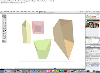
Tools - Pen tool, color picker, direct selection, etc. You will be creating your boxes using informal/rough linear perspective (as covered in class).
NO stroke (outline) for your boxes.
.jpg) Illustration 1. Box Orientation (apologies for OLD version of Illustrator in image)
Illustration 1. Box Orientation (apologies for OLD version of Illustrator in image)3. Organic Objects [Complementary Color (directly opposite on the color wheel) to Your Choice of Analogous Colors]:
NEW LAYER (3) -
You will now introduce ORGANIC objects into your composition - which will begin as a foreground. You will then allow yourself to "weave" together your composition (similar to Shape Elaborations).
Tools - Gradient mesh tool, pen, paintbrush, shape tools, etc.
In a similar vein to your geometric structure layer - "BOXES" - you are adding solid organic objects to contrast with the geometry of the preceding two layers. Remember points of highest contrast act as points of emphasis in your composition. With this layer we are creating the points of high contrast AND moments of integration (which you must decide how to utilize):
Color Contrast- You started with a grey scale pattern, then moved to analogous color (two colors), now to the ONE COMPLEMENTARY color of your analogous duo (opposite of your analogous colors on the color wheel).
Shape Contrast- Organic shapes will contrast with your geometric back/middleground.
Integration? We tend to group similar objects, shapes, colors, sizes, vales, movements - this bit of understanding can aid you in your decision making process. We're looking for some visual logic, consistency - within your composition (versus an arbitrary placement or relation). Focus on how your shape choices relate to the different layers/shapes - the same goes for your color choices, value choices and scale choices...etc...
We're looking to find a harmonious balance between unity and variety.
FINAL STEP:You are now in charge of unifying your composition by finding the "relationships" mentioned above. You can change layers, shift colors (tint, shade,tone), positions, etc.
**You must ALSO add AT LEAST ONE LIVE TRACE image. One you PLACE this image into Illustrator you can edit it, or manipulate it however you see fit. What this image is and how you choose to incorporate it is absolutely your choice (layer, size, color, etc).
My hint is to see what your composition requires. In other words, trying to force a picture of your favorite pet might be a difficult proposition - whereas there might be affinities between your shapes/colors and architecture, or modern furniture, or poster design. You might find yourself surprised.
LIVE TRACE (raster to vector graphic):
A. Under FILE menu in Illustrator , select PLACE.
B. In the menu that appears, find your image file, select it - BUT DO NOT PRESS OK! On the bottom of the menu you will see ADOBE DIALOGUE, and then LINK. Deselect LINK (there should NOT be a check mark).
C.Click OK...and the image will appear on your Artboard.
D.There is a horizontal bar of options running along the top of your Illustrator window. One option (near center) is LIVE TRACE with a small downward arrow next to it. Click this arrow to give LIVE TRACE OPTIONS WINDOW. Select PHOTO HIGH FIDELITY.
Illustrator is now attempting to translate your bit mapped image into a vector graphic (reading the value/color shifts and creating shapes - lines/points - to organize the image).
E. Under OBJECT menu find EXPAND APPEARANCE and select. Illustrator is now tracing each shape with lines/segments/points - this will allow you transform each individual piece of the image.
!!!PRINT out final copy on good quality paper and center, paste onto a crisp sheet of bristol board!!!
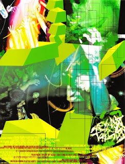
 Illustration 2. Student Example of Boxes
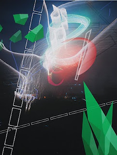
Illustration 3. Student Example of Boxes
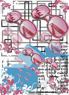
 Illustration 4. Student Example of Boxes
 Illustration 5. Student Example of Boxes
...again...these examples leave some things to be desired - and the students followed slightly different directions than you. So find your own voice!
BRING TO CLASS:
*Boxes Assignment
*All supplies - PLUS full COLOR range of acrylics.
