Homework:
*24 Photographs
*Keep working on TInt/Shade Chart from in class
Review
24 Photographs:
You can use any camera you choose:
A) Digital: Take as many pics as you want, but print them on photo paper either 4x6" or 8 x 10"
B) Film: 24 exposure should be fine but it's your choice - processed to 4 x 6" or whatever is standard (matte/gloss doesn't matter
C) Disposable: If you don't have access to a camera, buy a disposable (24 exposure should be fine).
Now, go out and hit the city. I am looking for some interesting shots with a dominant color scheme. For each color scheme (from the list below) you should have a photograph where that scheme is DOMINANT. For example, if your color scheme is complimentary and you see an amazing red neon sign next to a pine tree (just an example) - but there is a little blue in the building in the background (which hurts your true complimentary scheme) - DON'T WORRY! Just try to make your red/green relationship the dominant one. I will post a color handout on the OASIS site for those of you who need a paper copy.
Color Schemes/Relationships:
1. Monochromatic
2. Analogous
3. Complementary
4. Triadic
5. Split Compliment
6. Double Compliment
The folowing are more categories/types of colors, regardless, make them dominant in your photos.
7. Warm Colors
8. Cool Colors
9. Primaries
10.Secondaries
HINTS:
*A hues's appearance is directly related to its surroundings (context). Local color (i.e. the notion that a tree is brown and green) is always effected by the color of the light and what is next to it (background, foreground, etc.).
*For each color scheme you must choose a DOMINANT color, then subordinate color(s), and the accents. For example, red-green complementary: I would pick either red or green to be the dominant color in the picture. Let's say red. Then either green, or the neutral grey of mixing green and red would be secondary. Whichever color remains is your accent. That's a rough idea. Each of you will choose your own color structure (dom./sub./accent).
*Play with angles, scale, lighting, and REMEMBER the principles. With your list of color schemes, remember to bring a checklist of the principles of design. Vary the shapes, scale, organic/geometric, positive and negative shapes, rhythm and pattern, and so on...
* HAVE FUN WITH THESE!
Tint/Shade Chart
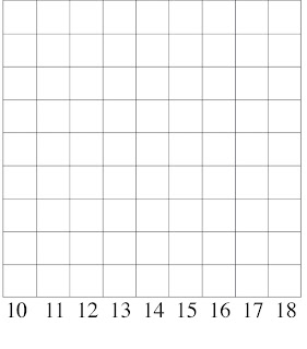
*Tape frame 2 sheets of your 11x 14" Bristol. We'll be working with a vertical orientation for these charts. Tape one inch on top and on both sides. Then tape bottomfour inches. This will give you a 9x9" square (for those of you who have a larger sheet to start with - center a 9x9" square and tape it off).
-Lightly grid the 9x9" square (giving you equal 1" squares).
Like your value scales using pencil and pen, you are now going to create a series of value (tint/shade) scales using your acrylics.
-Top square will be the lightest light (closest to white possible with your chosen color).
-Middle Square will be the "straight out of the tube" color - the most pure/saturated.
-Last square will be the darkest dark (closest to black while still recognizing the chosen color).
REMEMBER- Some colors you have to mix BEFORE youbegin to tint or shade them (oranges, violets). This also includes the colr you get when you CROSS COMPLEMENTS (red+green, violet +yellow, blue + orange, etc).
EXAMPLES BELOW:

Bristol#1 With Cadmium Red Column: The lightest red appears a bit too dark in my example...yours should be a close to WHITE AS POSSIBLE.
.jpg)

For Bristol #1 the color should lay out as follows(from Left to Right):
REDS
1. Cadmium Red
2. Alizarin Crimson
ORANGES
3. Cadmium Red + Cadmium Yellow
4. Alizarin Crimson + Cadmium Yellow
YELLOW
5. Cadmium Yellow
GREENS
6. Cadmium Yellow + Ultramarine
7. Cadmium Yellow + Prussian Blue
BLUES
8. Ultramarine
9. Prussian
For Bristoll #2 (Left to Right):
VIOLETS
10. Cadmium Red + Ultramarine
11. Cadmium Red + Prussian
12. Alizarin Crimson + Ultramarine
13. Alizarin Crimson + Prussian
CROSS COMPLEMENT/NEUTRAL GREYS
14. Red + Green (whichever red/green you choose)
15. Blue + Orange
16. Yellow + Violet
17. Black + White
18. Your Choice..find some unexpected color: sickly greens, bubble gum pinks, etc..
*When your painting is finished, take off your tape CAREFULLY! Then indicate your colors in light pencil under the corresponding columns.
