*Finish In-class Shape Projects (collaged Newspaper,etc.)
*Assignment - Shape Creation and Application: "Wallpaper Elaborations"
*DO NOT bring in an example of your personal work...I will view those during our midterm (I apologize, but there have been some technical issues).
----------
Shape Projects (from in-class)
1.Organic/Positive
2.Organic/Negative
3.Geometric/Positive
4.Geometric/Negative
Supplies:
Newspaper (use black and white image/text only), tape, x-acto/blades, glue stick, pencil, Bristol pad, sketchbook
Process:
-Tapeframe 4 sheets of bristol (one for each shape project).
-Using newspaper as medium (cutting, ripping, etc.), create imaginative solutions for the four shape problems outlined above. Apply cut pieces of newspaper with the glue stick.
-Use newspaper as a well to draw from: values, shapes, textures.
-Subvert imagery found in newspaper. DO NOT cut out whole images of people/scenery and apply them straight to the bristol. Remember my example of the Sinead O'Connor advertisement. Avoid cutting out her image and applying that to your bristol without FIRST changing that image. Use pieces of that image/other images to build another shape (contour of head, texture of hair, etc.).
-Remember we're building our own shapes, imaginatively and personally solving these shape problems.
Hints:
*Use another sheet of white paper (if needed) as an editing tool - to cover any collaged newspaper.
*Use your pencil (if needed) to sketch out or map your shapes. This goes for light compositional sketches on your bristol (to later get filled by collage), or for sketching out shapes on the newspaper BEFORE cutting.
*You can create piles of cut newspaper, and arrange them by value (maybe helpful for beginning).
*Keep in mind variety of shapes, textures, sizes (scale/proportion), rhythm.
*Keep in mind the direction of the lines of text - use to your advantage (cross hatching cut out lines of text to build textures, sun bursts with the same lines, etc...there are many possibilities).
Wallpaper Elaborations
Supplies:
Bristol pad, tape, pen/brusk/ink, black and white acrylic paint (plus brushes, jar/water, etc.), pencil, sketchbook
1. In Sketchbook:
Create a wallpaper design using positive, negative, organic, and geometric shapes - in HIGH CONTRAST -BLACK AND WHITE. Remember wallpaper tends to have some repeated elements, and occupies a very shallow (if not flat) space. Once you have your shapes created, then record a small example of the pattern in your sketchbook....THEN......move on to next step.
-Look at the examples under Element- Shape to the right on this site.
2. Bristol:
-Tapeframe 1 bristol board from pad.
-Record your wallpaper design (which is a pattern, a rhythmic structure) on your bristol using pen/brusk/ink (again...high contrast/BLACK AND WHITE).
-Work all the way to the edges of the taped frame.
-This is wallpaper remember, so avoid weak washy areas, or sketchy moments, we are looking for strong, sharp edges: Repeated shapes (positive,negative, organic, geometric) in black and white - high contrast!
-LET DRY!!!
Hints:
*Use your pencil to sketch out pattern on bristol BEFORE using ink.
3. Elaborations
*---Your pattern should be completely dry---*
In Sketchbook:
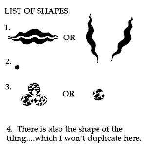
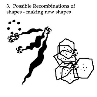
Identify, and make a list of the shapes you used in your wallpaper (clouds, stripes, bars, cookies, baseballs, or maybe abstract??etc...). Thes are the shapes you will use to build ON TOP of your existing, pen/ink Wallpaper pattern. Think of them as your bag of shapes to put together however you see fit. Change their combinations around...form new shapes, relationships,bend them, pull them, push them together...etc.
-Use BLACK AND WHITE ACRYLIC PAINT - AND ALL GREYS IN BETWEEN.
In Bristol:
It is now your opportunity to use the pen/ink Wallpaper pattern as a starting point, a base layer, to build a composition. Your pattern exists as a rhythmic underlayer or armature, for this "ELABORATION" part of the project.
-You are free to make editing, compositional choices (that INCLUDES keeping some items from your wallpaper or changing them as in value, scale, texture)
-You are painting a second layer of imagery on top of your pen/ink pattern using black and white acrylic paint and all their grey mixtures in between.
-Use the shapes in the pattern to build off of, repeat shapes/forms, create a second rhythm with your new shapes (from sketchbook)...and many more possibilites.
-Remember "The Principles" as you work (like a cheat sheet)!
-As you begin working, you will notice how the space in your drawing becomes much deeper as you add layers of imagery.
-Larger forms will begin to emerge as your the shapes in your pattern begin to "communicate" with your new HYBRID shapes. These larger forms will emerge due to accumulations of shapes, or when you connect the shapes from the pattern to your second layer of shapes.
Hints:
*Feel free to use your pencil to lightly sketch out shapes on bristol (with wallpaper pattern) BEFORE you paint them.
* Place a piece of your vellum over the wall paper to sketch out possible compositions.
*Cut a STENCIL of one of you shapes and use this to make a pattern
EXAMPLE OF WALLPAPER ELABORATION
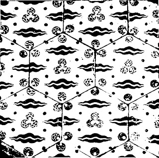
1. My Black and White High Contrast Wallpaper
2. List of shapes (sketchbook).
3. Recombination of shapes (sketchbook).
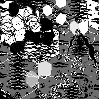
4. Elaboration
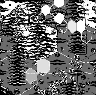
This piece is a bit chaotic...not quite unified. The DOMINANT, SUBORDINATE, and ACCENTUAL figures/shapes are not quite organized. Neither is the FOREGROUND, MIDDLE, BACKGROUND. I would have to keep working on this a bit longer.
*A possible next step would be to add one of my figures/shapes (from your sketchbook explorations)...You may come up with a different soultion.
This last image is still unresolved...but you will notice the addition of my sketchbook figures. I will now have to edite/modify past choices. Remember: We tend to group similarities of elements/principles - which keeps them on the same plane - at the same depth. Two similar values will look side by side (usually). So a good variety in contrast will help your compositions immensely!
