IN CLASS: PERSPECTIVE I*Discuss: Perspective (Concepte, Plane, Grid, Cube/Rectangle)
*In-Class Exercises: Spilled Cubes, 3 Pt. Imaginative Rotation
*Homework: 3 Pt. Radial Drawing
HOMEWORK:
*Finish In-Class Exercises in sketchbook (including "Spilled Cubes", "Imaginative Rotation").
*Finish 3 Point Radial Perspective (Drawing)
Click on the folder Spatial Systems located under LABELS (right side of website) for diagrams and illustrations concerning perspective.
Review for Perspectival Drawing:
REMEMBER!!
**Keep pencils sharp and points/lines accurate.
**Also, remember to begin with these four steps for EACH perspective:
1. Horizon
2. VPs
3. Ground Line/Anchor Point
4. Major Vertical(s)
**1 Point: 1 - 3 sides of object visible
**2 Point: 2 - 3 sides of object visible
**3 Point: 2 - 3 sides of object are visible + aerial perspective
****In Class Exercises: "Spilled Cubes" (in 2 Point perspective, geometric objects randomly spilled on the floor):
Material: Bristol, eraser, pencils, rulers, black pen.
First, practice drawing three cubes or rectangles in 2 Pt. Perspective (imagine three cubes/rectangles randomly spilled on the floor). RANDOM for our purposes means that each cube has its own set of vanishing points. Begin your drawing with light pencil lines (2 or 3H), and solidify your final shape by drawing over it with ink/ruler - erasing the trace lines (lines you used to measure and accurately draw your rectangles in 2 Point Perspective).
*All verticals are parallel
*Is there overlapping? Scale shifts?
Once you have drawn your three cubes/rectangular objects (#1, #2, #3), you will now begin to shape each cube - adding rectangular extensions and/or subtracting rectangular holes or windows per the directions below:
Cube #1: Using the same VPs as you used to create this cube, SUBTRACT rectangular shapes (imagine them as holes like in Swiss cheese, or windows in architecture). Starting from your initial cube/rectangle, imaginatively remove rectangles/cubes/and combinations of these to create a new unique shape.
Cube#2: ADD rectangular/cube-like extensions to this cube (again, using the VPs you used to draw the initial shape).
Cube#3: ADD and SUBTRACT rectangular shapes (windows, extensions, bridge like shapes, etc.) to this cube. Again, create a unique shape, and then make ONE connection between this cube/rectangle and another. Imagine a skyway or bridge, or duct work, that travels from this third shape to another (#1 or #2). HINT: Locate the flat square shape (window shape) where the extension begins and ends (THE FOOT PRINT)....FIRST! Then use the vanishing points to connect. If you imagine each shape as a physical object in front of you, you can then determine which lines would be IN REALITY PARALLEL. These lines should then converge at the same VP.
****In Class Exercises: "3 Pt. Imaginative Rotation":
Read through FIRST!! Then begin drawing!
Overview: 3 Point Perspective - Imaginative Rotation - In Sketchbook, create/draw a unique geometric object out of cubes and rectangles using 3 Point perspective - then rotate that object in your imagination. Use your sketchbook to jot notes, rough out sketches of how this object looks after rotation. Then draw the same object in its new orientation (rotated) on that same sheet of paper.
Materials: Sketchbook, pencil, pen, erasers
START WITH LIGHT PENCIL, SOLIDIFY/EMPHASIZE CONTOUR OF FINAL SHAPE BY ERASING TRACE LINES AND/OR DARKENING CONTOUR LINES.
In sketchbook with a ruled/pencil frame (1" around edges), construct a cube/rectangle in 3 Pt. perspective (keep to left or right of page). You will be drawing another shape on the same sheet so make sure to leave enough room.
A. Draw rectangle/cube, then add subtract elements (extensions/subtractions).
1.Locate Horizon line.
2.Locate Left Vanishing Point (LVP) and Right Vanishing Point (RVP) - both on the horizon.
3.Locate Third Vanishing Point (this point will be above or below the Horizon. HINT: Please locate you Third VP somewhere slightly off the page (if it's too close to the shape - your shape will be severely distorted).
4.Locate nearest corner of cube/rectangle (ANCHOR POINT) and then determine the length of that side of your rectangle (starting from the anchor point, you will be drawing the major vertical).
*All Verticals radiate from/towards the THIRD VP (so they are no longer parallel).
5.Construct your cube the same as in 2 Pt. perspectives. Determine/draw orthogonals (vertical lines radiating from the VP), and transversals (more horizontal lines). The only difference between 2 Point and 3 Point is that in 3 Pt., all verticals radiate from the Third Point.
6.Like the cubes/rectangles in 2 Point perspective, ADD/SUBTRACT rectangular/cube-like elements from/to your rectangle. Again, you can imagine these extensions as bridges/skyways/air ducts, and the subtractions as windows/holes/etc.
Once you have your UNIQUE object drawn. Solidify the contour by lightly darkening the contour and/or erasing the connecting traces lines.
B. Imagine this object to exist in the real world. Your FIRST drawing of this object places the viewer in a specific position in relation to this object. Eye level is the horizon, and the viewer is only allowed to see this ONE perspective of the unique object. As viewers, we want to see another view. Imagine that you rotate this object, or that a camera revolves around this unique object. This SPECIFIC VIEWPOINT will change how we view the object, and therefore change our drawing of that object.
I want you to imagine this object in a different position from the initial drawing. You can imagine this object in the real world and ask yourself: Where am I in relation to this object? Am I looking down? Am I looking up at it? Am I looking from a different side?
Draw this same object in a new imagined position, on the SAME sheet of paper as the first drawing. Use the same VPs. You're changing the object orientation (maybe we see the back ot it, or the side, or bottom), and its relation to the horizon (as compared to the first drawing....is it now higher/lower?).
Remember: You can make some rough (light) sketches in your sketchbook. Rough out a few options for your shape (as far as location and vantage point). Once you have decided on a new position, lightly sketch it out on your paper. Keep in mind the trace lines...but as your sketching, no need to be perfect (to begin with). You can sure up/solidify your perspective lines later. I'm not looking for mathematical precision here, when you change the orientation of your object (rotation, etc.) simply make sure all sides are approximately the same proportion as the original object/drawing.
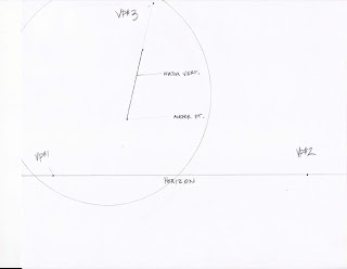
Imaginative Rotation (I.R.)Drawing Stage #1
Begin your first cube/rectangle as shown. The drawn circle indicates space within which I will draw my shape (helping me to organize the composition). Click on image for better view.
(I.R.) Drawing Stage #2
First view of rectangle (before ADDING/SUBTRACTING elements) - before it is a unique object in 3 Pt. Perspective. Notice Verticals all radiate from THIRD VP (and are not parallel as they are in 2 Pt. perspective). Lines that are in REALITY parallel, converge at the same vanishing point.
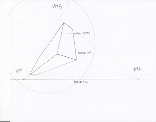
(I.R.) Drawing Stage #3
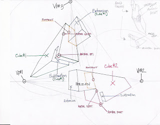
Second view of rectangle AS unique object. I have made ONE ADDITION and ONE SUBTRACTION. Your drawing will be much more in depth (mine is purely for example purposes). For extensions, remember to begin with the square footprint (yellow dotted line in illustration)- THEN add shapes.
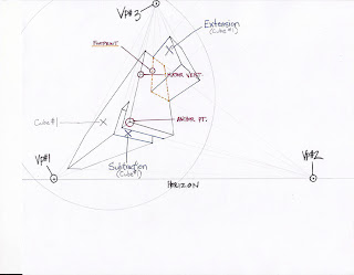
You have now completed your first unique object. Now things get complicated.
Imagine this object on a shelf...(in the picture above) it's above the horizon so I am looking UP at this unique object. If I were to reach up and slide my object to the right, what would my object look like (for example)? In my drawing I have shrunk the object a bit for the purposes of clarity. What's important is the proportion of sides. So the long side will be longer than the others for each view...this will have an effect on how you proceed. 3 Point perspective only allows the viewer to see 2 or 3 sides of the object. When you rotate your imaginary object and begin to sketch ideas - remember you may have to invent the characteristics of the other sides.
HAVE FUN! For my example I will keep things as separate and clear as possible.
USE YOUR SKETCHBOOK! It will be very helpful. Just sketch out possible positions (like my sketches in the upper right) starting with one point perspective, then add another, and finally add the third. Edit as you go. Again, image this object in the palm of your hand...turn it/hold it high/hold it low, how does it fit onto the page?
USE SAME Vanishing Points!
CHECK LIST:
Horizon - check (same)
VPs - check (same)
Anchor Point -
Major Vertical -
...and continue....
Feel free to get a bit more advanced and overlap the two images.
(I.R.) Drawing Stage #4
****Homework: "Radial Composition in 3 Pt. Perspective":
After your explorations of 2 Pt. and 3 Pt. perspective, this homework assignment should be a breeze. You will locate a third point, then radiate MAJOR VERTICALS from that 3rd point. You will then establish horizon lines and Vanishing points for each major vertical. In effect, you will be creating multiple constructions (rectangular/cube like forms) that radiate around your FIXED 3rd point until NO EMPTY SPACE EXISTS. This means that you will replace the white space of background/emptiness with the white space of activity/walls of constructions.
HINTS:
*Start with the basic cubes/rectangles
*Add/Subtract elements for each rectangle (as you have done in your 3 Pt. Perspective assignment from class - making UNIQUE OBJECTS)
*Keep in mind/utilize positive and negative space relationships.
1. Make a perfectly measured frame around your Bristol board using your ruler/pencil so your work space is 8 x 10" (I'm saving you some work - no need to work all the way to 11" x 14"). This frame is simply a line. This will take the place of the usual Tapeframe (DO NOT draw outside of the frame - if you have already taped it - fine).[Pencil/Ruler/Bristol]
2. Locate a point somewhere near the center of your Bristol - slightly off center is best.[Light Pencil] This point will serve as your UNIVERSAL THIRD POINT (vertical vanishing point in 3pt. perspective) in your composition.
3. Using your ruler, radiate lines from your Third Point, all of varying lengths, and make sure that none actually touch the Third Point, though it might be interesting if a few DO touch the border/frame you have created. These lines will act as anchor points/major verticals for constructions radiating from your central point. Imagine the corners of a whole bunch of rectangular objects in 3 pt. perspective. You will make 20-30 lines of varying length although you may add more or use less - (my illustration is abbreviated)! [Light Pencil]
RADIAL ILLUSTRATION #1
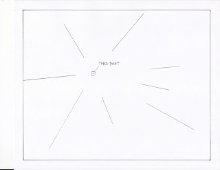
4. You will now begin to construct multiple cubes/rectangles around your Third Point.
a) To start...Choose one of your radiating verticals.
b) Establish and draw a Horizon line for EACH specific vertical of your choice(making it the Major Vertical). Experiment with horizon lines in different locations (see RADIAL ILLUSTRATION #4-notice how each Horizon line is drastically different).[Light pencil]
c) For the Major Vertical that you're working with, establish and mark Vanishing Points (left, right and you already have your third ). You may decide to locate a LVP or RVP off the page - that is perfectly fine. Just make sure it stays in a constant location throughout the drawing of each individual construction. Remember that for EACH MAJOR VERTICAL there is a new: horizon, LVP, RVP, for which to construct your object.
RADIAL ILLUSTRATION #2 [all lines are potential major verticles for structures]
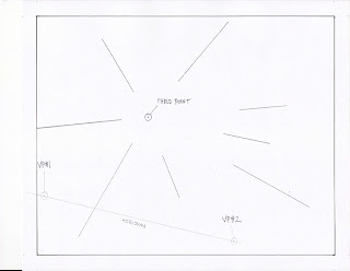
d) Fully construct cube/rectangle using the rules of Three Point Perspective. You might want to sketch a rough circle/rectangle (very lightly) before you choose your horizon/VPS - this will guide you in deciding how to best fit each rectangle/cube into your composition. You may also want to add or remove some of the existing radiating verticals (if they're in your way or possibly if one of your unique shapes covers a vertical). Use this overlapping to your advantage and create levels of depth. You can edit this composition how you see fit.
RADIAL ILLUSTRATION #3 [Rough/lightly drawn cubes/rectangles]
For clarity, I have limited the amount of overlapping in this illustration - I have kept the shapes fairly separate. You WILL have a lot overlapping. There are three shapes, horizons, sets of VPs (LVP-left, RVP-right), and anchor points and they are labeled A, B, C. (I've notched up the contrast to make the lines easier to see)
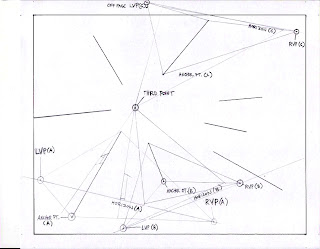
Now, simply move on to/selectively choose the next vertical, and construct another cube/rectangle. Continue this process until you have completely radiated around your third point and have no or VERY LITTLE white empty space remaining. Then go back over cubes/rectangles and ADD/SUBTRACT elements, adding connections, etc. You will notice the complexity of your drawing will rise as your constructions begin to overlap and connect.
RADIAL ILLUSTRATION #4
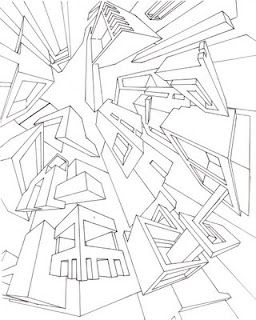
I have labeled the shapes (you will not label any of yours), and color coded each for clarity (INCLUDING my brief additions and subtractions - yours will include more advanced relationships). This final illustration clarifies each shape by darkening the contour (with color in my case) and erasing trace lines. You will notice I still have room to add extensions - I expect you all to thoughtfully organize, ADD and SUBTRACT elements to each of your unique shapes to succesfully create a balanced composition - see student example (last illustration).
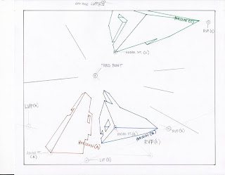
FINISH: After you have lightly PENCILED IN all objects - go over each with a ruler and pen to finalize/emphasize each object. Then erase pencil lines.
REMEMBER:
*Measure and draw each cube, solidify/emphasize contour, then ERASE trace lines, horizons, VPS (excluding Third Point).
*Vary each cube/rectangle/unique shape by adjusting scale, horizon lines, VPs, orientation, etc.
*My illustrations are only examples, your individual solutions to this assignment will be much more in depth and articulated.
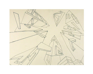
Student Example 1 (3pt.Radial):
I have asked you to continue your drawings until all empty white bristol is covered, or ACTIVATED by the walls of your structures. The illustration below did not fulfill this exact activation of space. For practical purposes, this activation could look like larger walls/objects behind the smaller scale constructions evident in the illustration below. In your version of the assignment you must still utilize your understanding of POSITIVE/NEGATIVE space/shape.
Student Example 2
BRING TO CLASS:
*3 Point Radial Perspective Drawing (pencil/pen on bristol)
*Sonic Landscape & 3 Orders of Space assignments (Sonic Landscape and 3 Illustrator pieces)
*Supplies (ruler, pencils, black writing pen/uniball, etc.)
NOTE: NO HOMEWORK OVER THANKSGIVING BREAK!
IN CLASS: PERSPECTIVE II
HOMEWORK:
Click on the folder Spatial Systems located under LABELS (right side of website) for diagrams and illustrations concerning perspective.
Review for Perspectival Drawing:
REMEMBER!!
**Keep pencils sharp and points/lines accurate.
**Also, remember to begin with these four steps for EACH perspective:
1. Horizon
2. VPs
3. Ground Line/Anchor Point
4. Major Vertical(s)
**1 Point: 1 - 3 sides of object visible
**2 Point: 2 - 3 sides of object visible
**3 Point: 2 - 3 sides of object are visible + aerial perspective
****You are now going to SCAN in your drawing and create THREE additional compositions in Illustrator. You will then print them on photo paper, trim, and fix them to bristol.
We have been dealing with methods of depicting 3D space on a 2D surface (DEEP - SHALLOW - FLAT). Concerning perspective, you have been using line only and determining spatial location by overlapping, diminution, and convergence.
YOU WILL NOW ADD COLOR, VALUE, and/or TEXTURE to your Radial Compositions. Beginning with a drawing (then scanned into Illustrator), you will create 3 individual pieces each emphasizing varying degrees of depth (DEEP-SHALLOW-FLAT).
Overview: SCAN drawing. Create THREE COMPOSITIONS. Print and hand in:
-3 Pt. Radial Drawing
-DEEP SPACE Composition on Illustrator
-SHALLOW SPACE Composition on Illustrator
-FLAT Space Composition on Illustrator
Think all the way back to your 3 Orders of Space assignment (4/7/08). You created three singular compositions each emphasizing a specific spatial schema (DEEP - SHALLOW - FLAT). Your homework for this week is a continuation of those ideas.
Beginning with your 3 Pt. Radial Composition (as an armature/skeleton/beginning layer) you will create 3 compositions on Illustrator - each composition must emphasize a specific spatial schema (DEEP - SHALLOW - FLAT). Basically, instead of using your Sonic Landscape assignment as a starting point (like you did in an earlier assignment - you're beginning with your 3 Pt. Radial Composition).
1. Scan your 3 Pt. Radial Composition and open in Illustrator. Lock and preserve this layer as a background to work off...as an armature for building a DEEP space...then editing to create a SHALLOW space then a simple and efficient FLAT graphic (you will be printing each, cutting down, centering, fixing to bristol). (working document is saved as .EPS and print files are .PDF).
2. We're "fleshing out" this skeleton of an under-drawing. We're translating our line drawing into a solid, full color composition with clear definitions of space. FOR EACH OF YOU: YOUR DRAWINGS SHOULD EVOLVE FROM COMPLEX/DEEP, TO SHALLOW/MEDIUM DEPTH/BALANCED, TO FLAT AND GRAPHIC. The first few steps of PLACING the drawing into Illustrator, drawing, and filling in will require some time. After you build your complex DEEP space composition you will edit, simplify/modify your composition towards SHALLOW then to FLAT.
A. To begin, we're going to remain using only line (now in Illustrator) to edit/elaborate your composition (you're going to trace your drawing using Illustrator, then continue drawing on the computer to further work your composition)- remember that we're working towards DEEP, COMPLICATED SPACE.
LINE - Using your under-drawing as a starting point, add, subtract, repeat, flip, transform, and make connections between your drawn structures STILL FOLLOWING YOUR PERSPECTIVE LINES (or adding new ones)! We're going to fill in our structures later - for now, simply take some time to adjust the armature of your composition (yes, you can always add more later). At this point you will have TWO layers: 1)Under-drawing (scanned radial comp.), 2) Line drawings/additions in Illustrator.
B. COLOR - Feel free to create another layer (or as many as you may need) in Illustrator to keep your compositions/evolutions organized.
Your composition is still in black and white and linear. We will now be adding color, opacity, and value to your constructions/rectangles. Remember your tools for creating depth and how color/value shifts with distance - these tools will guide you to make consistent decisions regarding color/value for your constructions. In practice, you will be tracing over your linear drawings, choosing FILL colors, and STROKE colors/size (where applicable). Remember the positions of FOREGROUND, MIDDLE-GROUND, and BACKGROUND and what choices you have to make to organize and communicate your understanding of these positions when creating your COMPLEX/DEEP space composition.
My advice is to use your pen tool (seems to be the most efficient) and literally trace your under-drawing (changing colors, values, opacity, maybe even adding some gradients with the gradient tool). This is the point at which you are free to really investigate your spaces...add/subtract elements, push and pull objects in space....create new objects...but REMEMBER!!!!
IT'S INCREDIBLY EASY TO GET CARRIED AWAY WITH YOUR COLOR AND SHAPES AND END UP WITH A MESS OF CONFUSED SPACE! COLOR AND VALUE ARE DETERMINED BY CONTEXT (WHAT COLORS SURROUND THEM) SO REMEMBER YOU CAN ALWAYS GO BACK AND CHANGE YOUR COLORS!
C. Again...start with your scanned drawing (as an armature/under-drawing) and begin to FIRST create a complicated, deep composition. Take some chances and push that composition as deep as you can. Then edit, refine, simplify for each successive composition working off the major movements, rhythms, color/value relationships from the composition before.
¡¡IMPORTANT!! SPECIFIC IDEAS/RELATIONSHIPS TO NOTE FOR THIS ASSIGNMENT:
*Positive/Negative
*Saturation
*Value
*Warm/Cool
CONTRAST (high, low, no, gradation)
CONTINUATION - as you work remember to not only take into consideration the small moments/details but the larger whole. Think of shapes/lines/colors that begin in one place - then reappear in another to create a larger/overarching META STRUCTURE.
REPETITION - think about creating some sort of rhythm with your constructions, are there similar shapes/colors that can be repeated/transformed to lead the viewr through the piece?
GROUPING - again, talking specifically about similarity amongst difference. We tend to group similar objects, shapes, movements, colors/values - so explore the ways in which you can use this tendency to your advantage. One example would be the same red rectangle in the foreground can be repeated and arranged around the surface to create a flat surface pattern - OR the shape can be lined up in a line/the colors can be desaturated/merged in value which then creates the appearance of a group that recedes gradually back into the distance.
3 Compositions:
1---DEEP: Large distance between foreground and background. This is created by emphasizing the ends of the spectrum (i.e. fore/back - which then creates a large area of middle-ground. So, FORE-near, MID - central, BACK - far.
2-SHALLOW: I have also called this shallow. This is the midpoint between deep and absolutely flat space.
3---FLAT: All objects fall directly on the surface (feel free to utilize overlapping - but attempt to keep your FLAT GRAPHIC DESIGN as "on the surface" as possible.
"3 POINT IN 3 ORDERS" ILLUSTRATION #1
"3 POINT IN 3 ORDERS" ILLUSTRATION #2
BRING TO CLASS:
*"3 Point Radial Perspective" Drawing (pencil,pen on bristol)
*"3 Point in 3 Orders" Assignment (3 Illustrator Compositions)
*Sonic Landscape & 3 Orders of Space assignments (Sonic Landscape and 3 Illustrator pieces)
*18 x 24 Sheet of Bristol/ All Supplies.
There's quite a bit of work this week. Focus and pull through. Next week we're easing up and working on a two week, self-driven Final Project due the last day of class. See you next week.
-----------------------PERSPECTIVE #2------------------------------------------------------------
OVERVIEW: PERSPECTIVE II
We have been dealing with methods of depicting 3D space on a 2D surface (DEEP - SHALLOW - FLAT). Concerning perspective, you have been using line only and determining spatial location by overlapping, diminution, and convergence.
YOU WILL NOW ADD COLOR, VALUE, and/or TEXTURE to your compositions. Beginning with a drawing (then scanned into Illustrator), you will create 3 individual pieces each emphasizing varying degrees of depth (DEEP-SHALLOW-FLAT).
IN CLASS:
*Hang/Discuss 3 Pt. Radial Perspective
*Lecture: Shade/Shadow/Volume Perspective (discussed next week)
*Homework
HOMEWORK:
*3 Point Space in 3 Orders
3 Point Space in 3 Orders
Materials: Illustrator, High Quality paper for printing (each composition on paper should be trimmed of borders), Bristol, Glue for fixing/presentation
Overview: Think all the way back to your 3 Orders of Space assignment (4/7/08). You created three singular compositions each emphasizing a specific spatial schema (DEEP - SHALLOW - FLAT). Your homework for this week is a continuation of those ideas.
You will be using your 3 Point Radial Composition (hand drawn collection of structures around a central/radiating 3rd point) for further investigation of SPATIAL SYSTEMS.
You will create 3 compositions on Illustrator beginning with your 3 Pt. Radial Composition as an armature/skeleton/beginning layer - each composition must emphasize a specific spatial schema (DEEP - SHALLOW - FLAT). Basically, instead of using your Sonic Landscape assignment as a starting point (like you did in an earlier assignment - you're beginning with your 3 Pt. Radial Composition.
1. Live Trace your 3 Pt. Radial Composition into Illustrator. Lock and preserve this layer as a background to work off...as an armature for building a DEEP space...then editing to create a SHALLOW space then a simple and efficient FLAT graphic.
2. In practice, we're "fleshing out" this skeleton of an under-drawing. We're translating our line drawing into a solid, full color composition with clear definitions of space. FOR EACH OF YOU: YOUR DRAWINGS SHOULD EVOLVE FROM COMPLEX/DEEP, TO SHALLOW/MEDIUM DEPTH/BALANCED, TO FLAT AND GRAPHIC. The first few steps of PLACING the drawing into Illustrator, drawing, and filling in will require some time. After you build your complex DEEP space composition you will edit, simplify/modify your composition towards SHALLOW then to FLAT.
A. To begin, we're going to remain using only line (now in Illustrator) to edit/elaborate your composition - remember that we're working towards DEEP, COMPLICATED SPACE.
LINE - Using your under-drawing as a starting point, add, subtract, repeat, flip, transform, and make connections between your drawn structures STILL FOLLOWING YOUR PERSPECTIVE LINES (or adding new ones)! We're going to fill in our structures later - for now, simply take some time to adjust the armature of your composition (yes, you can always add more later). At this point you will have TWO layers: 1)Under-drawing (scanned radial comp.), 2) Line drawings/additions in Illustrator.
B. COLOR - Feel free to create another layer (or as many as you may need) in Illustrator to keep your compositions/evolutions organized.
Your composition is still in black and white and linear. We will now be adding color, opacity, and value to your constructions/rectangles. Remember your tools for creating depth and how color/value shifts with distance - these tools will guide you to make consistent decisions regarding color/value for your constructions. In practice, you will be tracing over your linear drawings, choosing FILL colors, and STROKE colors/size (where applicable). Remember the positions of FOREGROUND, MIDDLE-GROUND, and BACKGROUND and what choices you have to make to organize and communicate your understanding of these positions when creating your COMPLEX/DEEP space composition.
My advice is to use your pen tool (seems to be the most efficient) and literally trace your under-drawing (changing colors, values, opacity, maybe even adding some gradients with the gradient tool). This is the point at which you are free to really investigate your spaces...add/subtract elements, push and pull objects in space....create new objects...but REMEMBER!!!!
IT'S INCREDIBLY EASY TO GET CARRIED AWAY WITH YOUR COLOR AND SHAPES AND END UP WITH A MESS OF CONFUSED SPACE! COLOR AND VALUE ARE DETERMINED BY CONTEXT (WHAT COLORS SURROUND THEM) SO REMEMBER YOU CAN ALWAYS GO BACK AND CHANGE YOUR COLORS!
C. Again (I'm like a skipping CD)..start with your scanned in radial composition (as an armature/under-drawing) and begin to FIRST create a complicated, deep composition. Take some chances and push that composition as deep as you can. Then edit, refine, simplify for each successive composition working off the major movements, rhythms, color/value relationships from the composition before.
¡¡IMPORTANT!!SPECIFIC IDEAS/RELATIONSHIPS TO NOTE FOR THIS ASSIGNMENT:
*Positive/Negative
*Saturation
*Value
*Warm/Cool
CONTRAST (high, low, no, gradation)
CONTINUATION - as you work remember to not only take into consideration the small moments/details but the larger whole. Think of shapes/lines/colors that begin in one place - then reappear in another to create a larger/overarching META STRUCTURE.
REPETITION - think about creating some sort of rhythm with your constructions, are there similar shapes/colors that can be repeated/transformed to lead the viewr through the piece?
GROUPING - again, talking specifically about similarity amongst difference. We tend to group similar objects, shapes, movements, colors/values - so explore the ways in which you can use this tendency to your advantage. One example would be the same red rectangle in the foreground can be repeated and arranged around the surface to create a flat surface pattern - OR the shape can be lined up in a line/the colors can be desaturated/merged in value which then creates the appearance of a group that recedes gradually back into the distance.
3 Compositions:
1---DEEP: Large distance between foreground and background. This is created by emphasizing the ends of the spectrum (i.e. fore/back - which then creates a large area of middle-ground. So, FORE-near, MID - central, BACK - far.
2-SHALLOW: I have also called this shallow. This is the midpoint between deep and absolutely flat space.
3---FLAT: All objects fall directly on the surface (feel free to utilize overlapping - but attempt to keep your FLAT GRAPHIC DESIGN as "on the surface" as possible.
BRING TO CLASS:
*3 Point in 3 Orders Assignment
*In class I will go over a few details concerning perspective...then an explanation of your FINAL PROJECTS (and allow studio time to get the project underway).
SHAPE ASSIGNMENTS (POS/NEG - COLLAGE)
OLD ASSIGNMENTS:
1)SHAPE-In class newspaper collage
Finish In-Class Explorations: Newspaper Collage
Materials: Newspaper (black and white only),glue stick, xacto knife, pencils, rulers, bristol, sketchbook
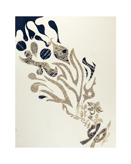
Overview: Investigate shape creation, figure/ground relation and compositional balance utilizing efficient and successful organic/geometric and positive/negative shape relationships.
You will be making 4 compositions (4 sheets of bristol) with cut newspaper - arranging shapes and fixing them to your paper. Each composition requires you to emphasize a specific shape relationship as follows:
A. Organic/Positive
B. Organic/Negative
C. Geometric/Positive
D. Geometric/Negative
!!!Remember that each composition will have BOTH positive and negative space. The goal is to emphasize one or the other (depending on which is required). Emphasize by contrast: scale, value, texture, line quality.!!!
Organic: Irregular Shapes/Contours (usually naturally occurring)
Geometric: Straight lines/angles/symmetry (including named shapes like rectangle, cube, circle, triangle, etc.). There are some naturally occurring geometric shapes like snowflakes, crystals, soap bubbles, etc.
Positive: Object-Figure-Additive
Negative: Background-Ground-Subtractive
1. Using your pencil and ruler, mark a 1" border/frame around each bristol-4 in total (this is a substitute for the tape).
2. Start your compositions one at a time - utilize your sketchbook to record ideas/strategize composition (if needed).
3. Cut/Arrange/Glue your newspaper shapes (following the guidlines for each composition) making sure they are securely fixed to the bristol (no dog eared corners).
Hints:
*start simple/make sketches in sketchbook or hold off on the glue until you have the shapes in position
*looking for COMPLEX but CLEAR compositions
*Avoid recognizable images/words (famous people/products/large-whole phrases, etc.)
*Use another sheet of bristol to cut up/glue over newspaper for editing (if needed)
*Sentences are LINES of text - and in images there are LINES (implied or actual): pay attention to their direction/orientation - you might be able to use them in your composition.
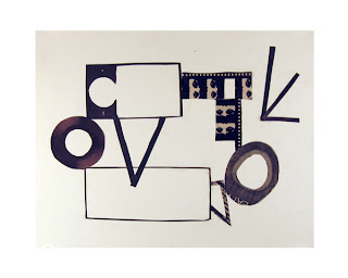
EXAMPLES:
HOMEWORK:
*Finish Sonic Landscape Project
Sonic Landscape:
You should each have a one page description/investigation of a song of your choosing - SPECIFICALLY focusing on particular elements of your song (as covered extensively in class). We are going to translate your ideas into a two dimensional mixed media project.
1. Sketches/Brainstorming: Imagine the spatial elements in your choice of music, with all the attendant color, line, and shape relationships. Make some sketches, preliminary studies/records of ideas, and work out some possible compositions in your sketchbook. It is clear that the majority of you have many of the elements worked out. Now it's time to put it all together - compositional studies! Use the elements and principles as a check list - vary the qualities of each (line, shape, texture, value, color). Work through some ideas in your sketchbook. Ideally, you will have multiple thumbnail sketches/compositional studies for this assignment.
2. Sonic Landscape: Basically you will be taking the information you've gathered (sketches, mock ups, notes) and you will create your final piece.
Medium: Your choice - Illustrator, collage, paint, ink, pencil, or a mixture.
Size: 8" x 10" (smallest) up to 11" x 14". Remember to keep your images as flat as possible (no mounting on board/stretchers/etc. We need to be able to scan these images in a scanner.
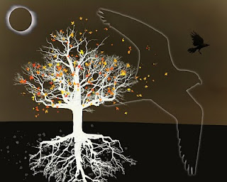
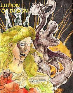
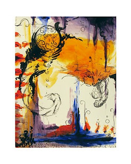
Student Examples


BRING TO CLASS:
*Sonic Landscape Project
*Entire Portfolio
*We will be using Illustrator next week - so bring sketchbooks, jump/thumb drives, etc...
PERSPECTIVE II (2011)
IN CLASS: PERSPECTIVE II:
*Discuss Value/Shade -->Volume/Mass (Class exercises)
*Discuss Shadow Perspective
*Studio: Two drawings in Sketchbook
1) 3 Rectangles/2pt. persp. (1VPL/VPS)
2)1 Rectangle/2pt. persp. (3 VPL/VPS)
OVERVIEW: PERSPECTIVE II
We have been dealing with methods of depicting 3D space on a 2D surface (DEEP - SHALLOW - FLAT). Concerning perspective, you have been using line only and determining spatial location by overlapping, diminution, and convergence.
YOU WILL NOW ADD COLOR, VALUE, and/or TEXTURE to your compositions. Beginning with a drawing (then scanned into Illustrator), you will create 3 individual pieces each emphasizing varying degrees of depth (DEEP-SHALLOW-FLAT).
IN CLASS:
*Hang/Discuss 3 Pt. Radial Perspective
*Lecture: Shade/Shadow/Volume Perspective (discussed next week)
*Homework
HOMEWORK:
*3 Point Space in 3 Orders
3 Point Space in 3 Orders
Materials: Illustrator, High Quality paper for printing (each composition on paper should be trimmed of borders), Bristol, Glue for fixing/presentation
Overview: Think all the way back to your 3 Orders of Space assignment. You created three singular compositions each emphasizing a specific spatial schema (DEEP - SHALLOW - FLAT). Your homework for this week is a continuation of those ideas.
You will be using your 3 Point Radial Composition (hand drawn collection of structures around a central/radiating 3rd point) for further investigation of SPATIAL SYSTEMS.
You will create 3 compositions on Illustrator beginning with your 3 Pt. Radial Composition as an armature/skeleton/beginning layer - each composition must emphasize a specific spatial schema (DEEP - SHALLOW - FLAT). Basically, instead of using your Sonic Landscape assignment as a starting point (like you did in an earlier assignment - you're beginning with your 3 Pt. Radial Composition.
1. Live Trace your 3 Pt. Radial Composition into Illustrator. Lock and preserve this layer as a background to work off...as an armature for building a DEEP space...then editing to create a SHALLOW space then a simple and efficient FLAT graphic.
2. In practice, we're "fleshing out" this skeleton of an under-drawing. We're translating our line drawing into a solid, full color composition with clear definitions of space. FOR EACH OF YOU: YOUR DRAWINGS SHOULD EVOLVE FROM COMPLEX/DEEP, TO SHALLOW/MEDIUM DEPTH/BALANCED, TO FLAT AND GRAPHIC. The first few steps of PLACING the drawing into Illustrator, drawing, and filling in will require some time. After you build your complex DEEP space composition you will edit, simplify/modify your composition towards SHALLOW then to FLAT.
A. To begin, we're going to remain using only line (now in Illustrator) to edit/elaborate your composition - remember that we're working towards DEEP, COMPLICATED SPACE.
LINE - Using your under-drawing as a starting point, add, subtract, repeat, flip, transform, and make connections between your drawn structures STILL FOLLOWING YOUR PERSPECTIVE LINES (or adding new ones)! We're going to fill in our structures later - for now, simply take some time to adjust the armature of your composition (yes, you can always add more later). At this point you will have TWO layers: 1)Under-drawing (scanned radial comp.), 2) Line drawings/additions in Illustrator.
B. COLOR - Feel free to create another layer (or as many as you may need) in Illustrator to keep your compositions/evolutions organized.
Your composition is still in black and white and linear. We will now be adding color, opacity, and value to your constructions/rectangles. Remember your tools for creating depth and how color/value shifts with distance - these tools will guide you to make consistent decisions regarding color/value for your constructions. In practice, you will be tracing over your linear drawings, choosing FILL colors, and STROKE colors/size (where applicable). Remember the positions of FOREGROUND, MIDDLE-GROUND, and BACKGROUND and what choices you have to make to organize and communicate your understanding of these positions when creating your COMPLEX/DEEP space composition.
My advice is to use your pen tool (seems to be the most efficient) and literally trace your under-drawing (changing colors, values, opacity, maybe even adding some gradients with the gradient tool). This is the point at which you are free to really investigate your spaces...add/subtract elements, push and pull objects in space....create new objects...but REMEMBER!!!!
IT'S INCREDIBLY EASY TO GET CARRIED AWAY WITH YOUR COLOR AND SHAPES AND END UP WITH A MESS OF CONFUSED SPACE! COLOR AND VALUE ARE DETERMINED BY CONTEXT (WHAT COLORS SURROUND THEM) SO REMEMBER YOU CAN ALWAYS GO BACK AND CHANGE YOUR COLORS!
C. Again (I'm like a skipping CD)..start with your scanned in radial composition (as an armature/under-drawing) and begin to FIRST create a complicated, deep composition. Take some chances and push that composition as deep as you can. Then edit, refine, simplify for each successive composition working off the major movements, rhythms, color/value relationships from the composition before.
¡¡IMPORTANT!!SPECIFIC IDEAS/RELATIONSHIPS TO NOTE FOR THIS ASSIGNMENT:
*Positive/Negative
*Saturation
*Value
*Warm/Cool
CONTRAST (high, low, no, gradation)
CONTINUATION - as you work remember to not only take into consideration the small moments/details but the larger whole. Think of shapes/lines/colors that begin in one place - then reappear in another to create a larger/overarching META STRUCTURE.
REPETITION - think about creating some sort of rhythm with your constructions, are there similar shapes/colors that can be repeated/transformed to lead the viewr through the piece?
GROUPING - again, talking specifically about similarity amongst difference. We tend to group similar objects, shapes, movements, colors/values - so explore the ways in which you can use this tendency to your advantage. One example would be the same red rectangle in the foreground can be repeated and arranged around the surface to create a flat surface pattern - OR the shape can be lined up in a line/the colors can be desaturated/merged in value which then creates the appearance of a group that recedes gradually back into the distance.
3 Compositions:
1---DEEP: Large distance between foreground and background. This is created by emphasizing the ends of the spectrum (i.e. fore/back - which then creates a large area of middle-ground. So, FORE-near, MID - central, BACK - far.
2-SHALLOW: I have also called this shallow. This is the midpoint between deep and absolutely flat space.
3---FLAT: All objects fall directly on the surface (feel free to utilize overlapping - but attempt to keep your FLAT GRAPHIC DESIGN as "on the surface" as possible.
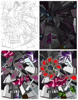
Student Example 1 (from top left): Drawing, Deep, Shallow, Flat
Student Example 2 - Deep
Shallow
Flat
BRING TO CLASS:
*3 Point in 3 Orders Assignment
*Portfolio, Supplies
VALUE::::::PHOTOGRID
PHOTOGRID:
NOTE: I handed out photographic prints to each of you. If you were NOT in class you will receive an email from me containing the image. Print this pdf and follow the directions.
Materials: Bristol, pencils (etc.), ruler , tape (?), photograph (I will provide).
Overview: Investigate value through the process of grid enlargement in the translation of a grey scale photographic source to a larger scale drawing.
You will grid out your photo (which is your source material) AND your bristol. The photo is exactly half the size of the bristol (image area/not the white border) but equal in proportion. Lightly draw a grid DIRECTLY on your photo (1/2" squares - use a fine marker or pen) AND your bristol (1" squares - use a sharp but light pencil so you can erase the lines later).
Use of grid: A grid can aid in understanding the structure of an image, and assist in faithfully locating specific value, texture, and shape relationships. This technique is also useful in the enlargement of images (murals for examples).
Photo (minus the white border): 5.5" x 7"
Bristol: 11" x 14"
GRID PHOTO: Using a sharp, light/hard pencil and ruler, grid out photo into 1/2" squares.
GRID BRISTOL: DO NOT TAPE!! Use a ruler and light/soft pencil grid out bristol into 1" squares - all the way to the edge. The grid is only a light guide for your bristol and will be incrementally erased as you draw~! So when you're finished you will not see the grid in yor drawing.
Process: Move from one square to the next, and mimic values, textures, lines, shapes - EXACTLY. Use smooth transitions/gradations of graphite (blending). Start light and work towards the correct value. It may help to locate the darkest dark and the lightest light (contrast ratio). Remember that the lightest areas of your photo are not as white as the paper.
***Once finished protect your drawing by securing a sheet of your vellum on top (you don't want all your hard work to smudge!)***
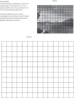
Illustration 5. PHOTOGRID
BRING TO CLASS:
*PHOTO GRID and photograph
*FLASH DRIVE!!! Or CD to save in-class work!
*We will be covering TEXTURE next week and working with Illustrator
